![[#Blogged] - Paarth Jolly](https://blogger.googleusercontent.com/img/b/R29vZ2xl/AVvXsEivbQRyDoXas1E4qfP0jEpkR7g7LJ0-ZvxFOXhhOjUWqP1cnZx0UG2BTFcNMlv1loj6WfdM9HKelMRJwkGdjGRb6TA7dCtpqUNKAYp7PqFH5hhpQd6z9VoCAhLcCr_2urDU1uiizWdLSbeR/s1600/SalesforceCertificateLogo.png)
I recently released my blog post on “5 Features I love about Lightning Reports”, but today I wanted to touch on a few great features of Lightning Dynamic Dashboards. These dashboards (as opposed to Classic) are more user-friendly and have more points of adjustments than the Classic framework. Dynamic Dashboards are specifically dashboards used by more than one person that allows them to see the data as it pertains to themselves (as opposed to creating multiple, identical dashboards for each specific user). They can seem intimidating, but just like learning anything with Lightning, the key is to discover the capabilities of this tool and start practising.
This post will point out those capabilities for you to feel more empowered as you begin putting those reports you’ve created to great use.
For this post, it is worth noting that I am not including any Einstein Analytics features, but am focusing more on the parts that everyone can use since Einstein Analytics requires a separate license. With that being said, let’s dive into 5 Basic Features to Learn on your Dynamic Dashboard!

1) Adjustable Components - Picture this: You’ve finally adjusted your source report chart to be “just so”, spending hours to tweak it here and there, and it looks great….until you put it on your dashboard. All of a sudden, that neat bar graph is a cluster of illegible numbers and letters, crammed in the limited space on your Classic dashboard, with no way possible for anyone to make sense of the jumble in front of them. What should have been a one-stop visual for your leadership team now requires them to click into the component just to see the graph and reporting data. That’s not the most efficient use of time, especially if you have multiple graphs, requiring multiple clicks. This is where adjustable components on Lightning dashboards come in. Now, you get to dictate the size of the components you’re displaying, as well as the overall layout. Whether you have a line graph that should headline the top of your dashboard, want to nest a grouping of gauges as four tiles on the right-hand side, or toggle between a 12 column vs. 9 column dashboard, you get to adjust this to your heart’s content.
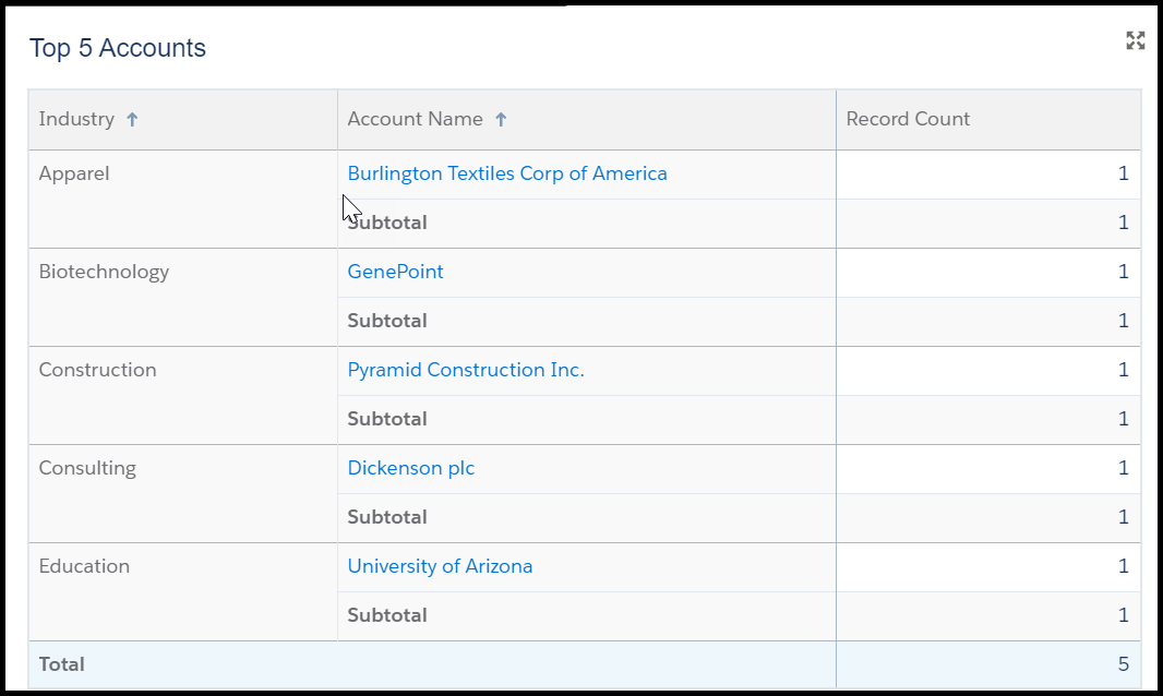
2) Use a Lightning Table - There are times when tabular data (basically a list or table) fits your needs sufficiently without requiring a visual such as a bar graph or gauge. Tabular components are good for information such as “Top 5 Opportunities based on Revenue”, or “Top 10 Accounts in Danger of Terminating”. In Classic, the most you could do with tabular information was limit the number of results visible in your component, with a few adjustments available for the columns visible. While Classic does “meet your needs” with this, Lightning takes it a few steps further to make it more customizable. A Lightning Table allows you to show up to 200 records with 10 columns, group data with measures (such as sum, average, maximum, and minimum), and use a summary formula column. Also, Lightning Tables support two groups and allow you to show subtotals on first level groupings. These are great features to take relatively flat data and make it easier to analyze!

3) View who people view as - One of the most frustrating points of Classic Dashboards had to be the limited viewing capabilities. It wasn’t an uncommon issue for companies to have a templated dashboard that had to be customized for each Sales user, resulting in hundreds of dashboards over time. This could create major issues for System Admins responsible for creating, updating, and retiring these dashboards, spending upwards of weeks depending on what needed to be done. A Dynamic Dashboard puts an end to all of that hassle with the ability to choose who people view the dashboard as. Using permissions and sharing settings, one dashboard can be created for many users. This means there can be just two dashboards for the whole sales department (one for management, and one for sales reps). Not only does this save a ton of time for System Admins, but it also ensures that everyone is seeing the same components consistently over time. There are three options for “View Dashboard As”:
- Me - people view the dashboard as you (but this is not recommended if you are a System Admin, as they will more than likely encounter permissions issues)
- Another Person - you can choose someone else for viewers to see the dashboard as
- The Dashboard Viewer - the data is seen as it pertains to the specific viewer

4) Themes & Color Palettes - One of the facets that makes Dynamic Dashboards so visually interesting is the use of the Light or Dark theme. This isn’t just a great way to save yourself from eye strain by using the Dark Theme; you can also select specific components to display in the opposite theme to highlight a particular section of your dashboard. Also, the color palettes are a great way to make your visuals more appealing, especially if you can find a palette complimentary to your brand or logo. It is worth noting that dashboard subscription emails do not display color palettes and themes, so make sure you try that out in case you receive any questions from your users.

5) Keyboard Shortcuts - Some of us are just more accustomed to keyboard navigation, and a computer mouse just slows us down. Well, now you can celebrate the use of keyboard shortcuts to edit your Dynamic Dashboards! A few of the shortcuts are pretty standard, like “Ctrl+Z” for “undo” and “Ctrl+S” for “save”, but you can also use the spacebar and arrows to change component size and “Ctrl+N” for a new component. Definitely take some time to try this out and see if it saves time creating your new dashboard!
If you need some practice for creating your Dynamic Dashboard, make sure to check out the Trailhead module “Visualize your data with the Lightning Dashboard Builder”. You can find this and other Trailhead modules to further your Lightning experience in my recent post “5 Lightning Trailhead Modules to Start Learning on Today”.
Further Reading:
Build a Lightning Experience Dashboard
Edit Dashboards with Keyboard Shortcuts in Lightning Experience
Switch Between a 12 or 9-Column Dashboard Layout
Color Dashboard Data with Themes and Palettes
Show Tabular Information with a Lightning Table
No comments:
Post a Comment