![[#Blogged] - Paarth Jolly](https://blogger.googleusercontent.com/img/b/R29vZ2xl/AVvXsEivbQRyDoXas1E4qfP0jEpkR7g7LJ0-ZvxFOXhhOjUWqP1cnZx0UG2BTFcNMlv1loj6WfdM9HKelMRJwkGdjGRb6TA7dCtpqUNKAYp7PqFH5hhpQd6z9VoCAhLcCr_2urDU1uiizWdLSbeR/s1600/SalesforceCertificateLogo.png)
Part 8: Get the Skinny on Reports and Dashboards
Back in Part 2 of our series called Salesforce Administrator Guide: Propelling your Career Forward, I discussed basic admin skills to master in order to increase your value as a Salesforce Admin. Today, for Part 8, I want to dig a little deeper, specifically into Reports and Dashboards, as this is a great skill to master and will allow you to further support pretty much every department in your company. Let’s discuss what they are and why they’re important.
Reports
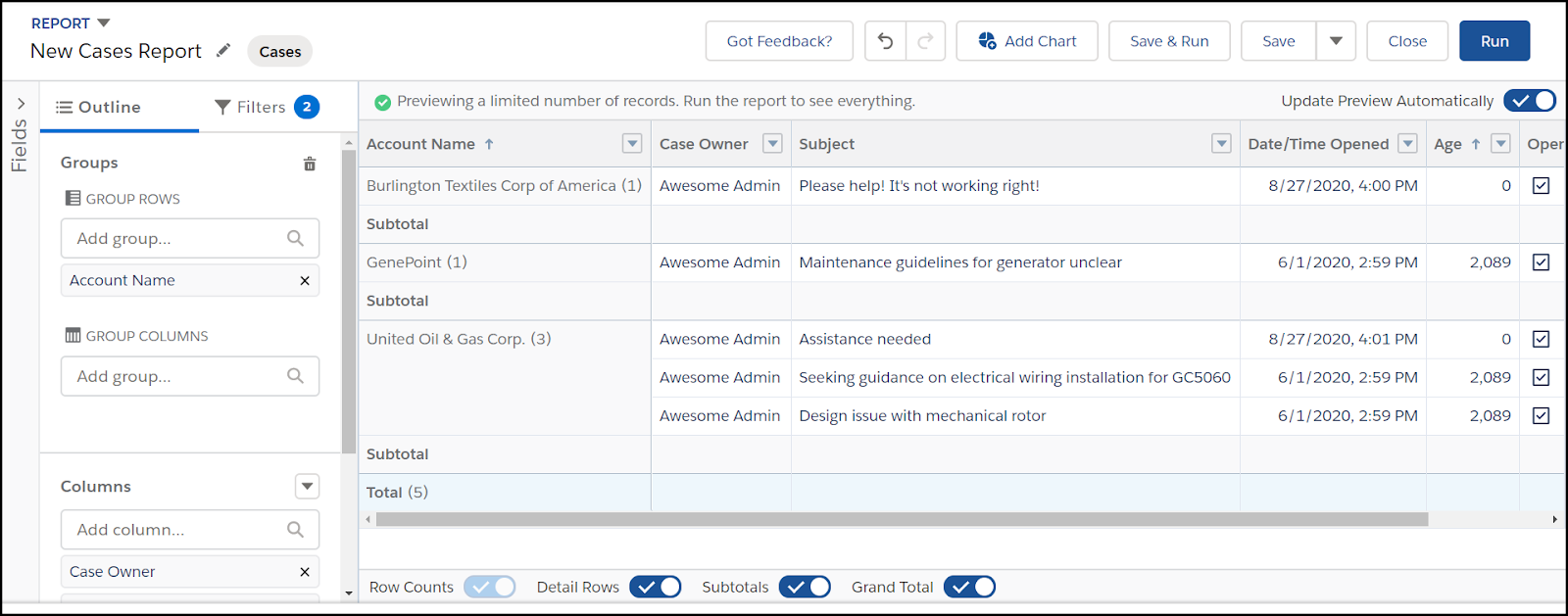
Image: Report Builder in edit mode...also where the magic happens!
Whether it is your Sales manager looking for the number of Closed Opportunities for the month, or a Customer Support representative trying to better understand how they’re spending time on their cases, Salesforce reports are a crucial tool for chopping up information into easy-to-digest pieces. Before you dive in, there is something important you must understand - if the data doesn’t exist in Salesforce, then the report cannot display it. Unfortunately, there is a misconception (usually amongst end users) that the reports can pull your company data and analyze it in a flash. While it can provide great results in a small turnaround time, it can only be as good as the data in the system. Poor data equals poor reporting.
Once you’ve got a handle on implementing good data practices, it really is fun to jump right in. When creating a new report, think of it as a blank canvas holding every single record you have in Salesforce, and you get to narrow it down (with Filters) and organize it (with the ability to group rows and group columns). You also get to decide which parts of the data you want to actually see in the report (which are your columns). On the Report Editor, you also get to show Subtotals, and the Grand Total, which is great for summarizing your numerical data.
Keep in mind, this is just the tip of the iceberg. But once you create (and save!) a report, you need a great way to display it, right? Well, that’s where dashboards come in.
Dashboards
While you can add charts to reports, dashboards offer a collective view into multiple metrics in one glance. Your end users can start their day by diving into a refreshed dashboard as they sip their coffee, and focus in on the areas that need the most attention without wasting any time.
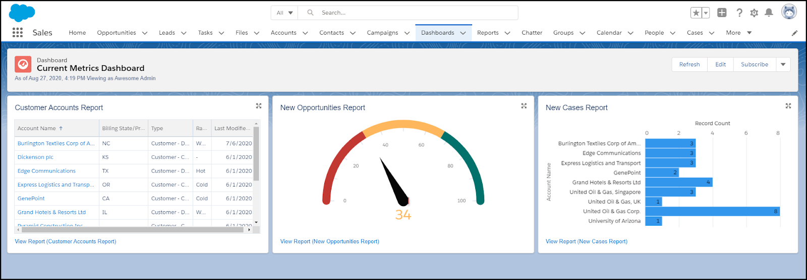
Image: Understanding data is much easier when it’s visual.
Dashboard parts are called components, and each component consists of one report. But what if my company needs to see more than three components!? No worries - think of a dashboard as a corkboard with malleable features, as you can squeeze in up to 12 columns and 20 components in a Lightning dashboard. You can display the data in graphs and visuals that best suit the information. Maybe you need a gauge to push sales reps to move that needle this quarter, or you need a bar graph to show comparisons between team members working towards their goals, or you simply need a short list of 5 accounts that need the most attention right now. Either way, there are numerous ways to display the data, and you get to design it the way you see fit.
Reports and Dashboards are one of the most commonly requested tools to show company analytics, and they’re actually really fun and easy to learn. Get started today by searching for Reports or Dashboards tabs or search your App Launcher.
No comments:
Post a Comment